Rebrand
Tūhono Taonga, Tūhono Tāngata
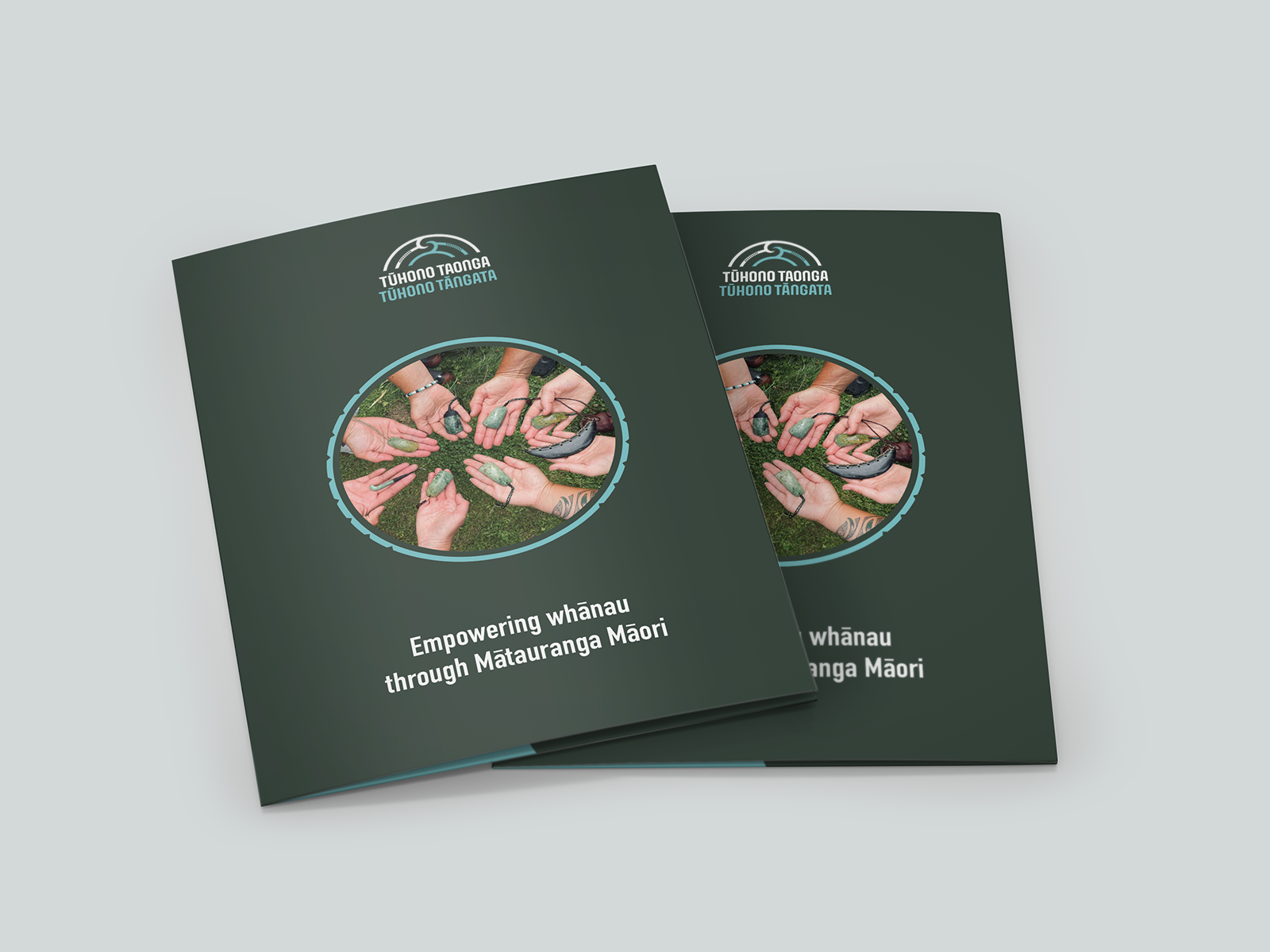
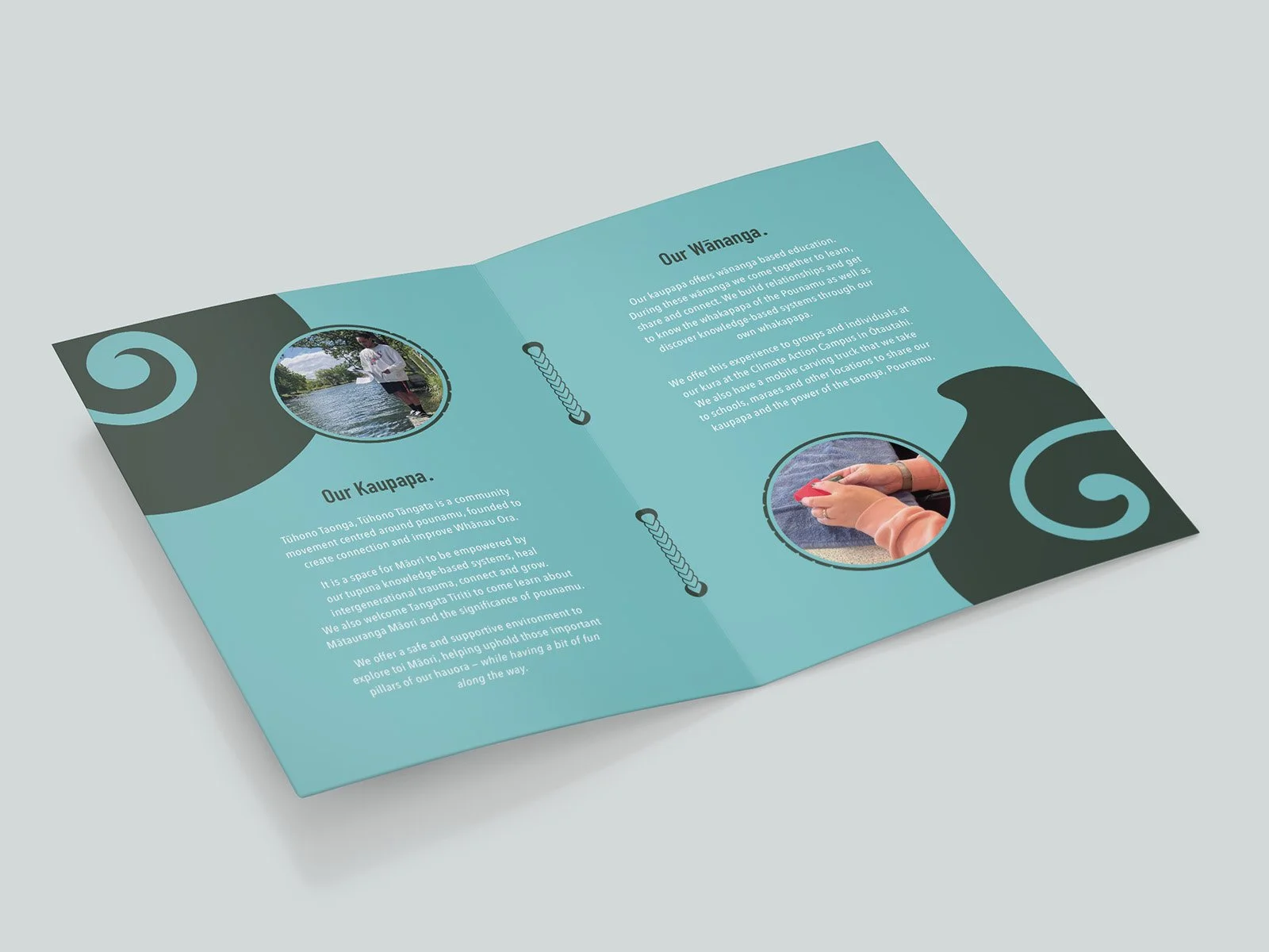
This brief involved rebranding Tūhono Taonga, Tūhono Tāngata to bring it into a more contemporary space. It needed to reflect the kaupapa, uphold tikanga and honour the brand’s history.
The narrative behind this logo speaks of the kaupapa’s values: mātauranga Māori, wairua, whānau and tūhononga. The top ridge lines represent the maunga and the bottom lines portray the awa. Meeting in the middle they form the rauru which symbolises the creation of taonga and connections.
With founders; Jon Jeet and Irihāpeti Mahuika being the heart of this community initiative, I saw it important to also visually include their whakapapa. This can be seen through the two elements uniting together and through the haehae which represents their 9 tamariki.
The colour palette showcases the deep green that can be found in pounamu and the vibrant blue of the Arahura river.


